We empower teams to deliver high quality products faster
Introducing the Product design toolkit
Design is a team effort. As part of the Nordic Cool 4 launch, the product design team is providing the product development organisation with a Product design toolkit, with the goal of speeding up the design process to make room for creativity and innovation.

Speeding up design
In the Visma Figma toolkit you will find a DIY design guide, together with the Nordic Cool colour palette, the most common UI components and patterns, icons and illustrations and shadow and font guides.

Speeding up development
Using the Visma Figma toolkit together with the Web library and UX Guidelines will enable your team to visualise ideas and create and test prototypes faster, shortening the time from concept to delivery.

Making room for creativity and innovation
When everyone can design, the product design team can focus on custom requests, explore and develop the design language and provide you with more inspiration for how your team can make your product stand out with Nordic Cool.
Web library and guidelines
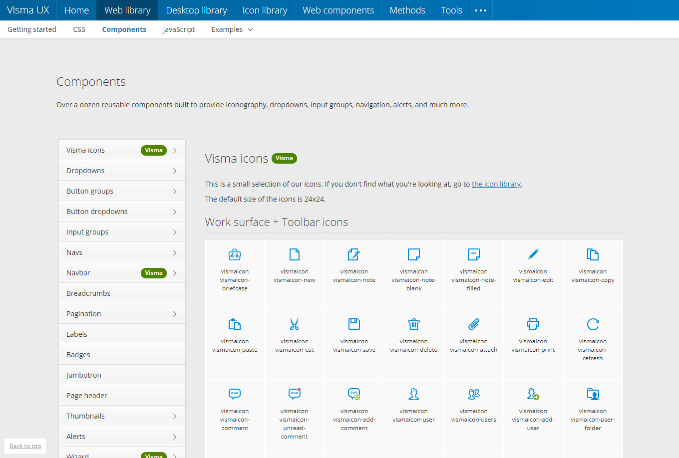
In the Web library you will find code (HTML and CSS) and UX Guidelines for our most common UI elements, such as buttons, dropdowns and date pickers to give a few examples.
The Web library is continuously updated by the Product Design team. New UI elements are added upon request and if they are of interest to multiple projects.
Questions, contributions and feedback is welcome via Slack using the #sig-web-library channel. If you are not a member of Slack you can contact us via email.
Icon library
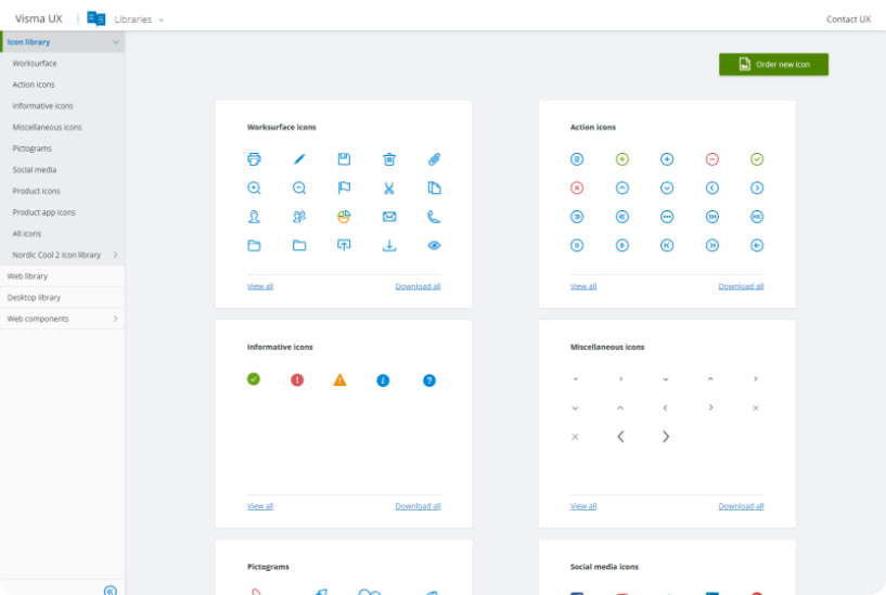
In the Icon library you will find the most common icons and illustrations used in our products, such as worksurface icons, action icons and pictograms.
The icon library is updated continuously by the Product Design team. If you cannot find an icon for the specific context you need, the team will create it for you upon request.
Desktop library
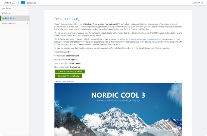
Visma’s Desktop library is built using Windows Presentation Foundation (WPF) technology. It’s intended both as a live version of the design in the UX guidelines and as a resource when building desktop applications.
The library aims to create a reusable base for our desktop applications with a Nordic Cool 3 design and functionality.
The SMB division is responsible for the WPF library.
Brandbook
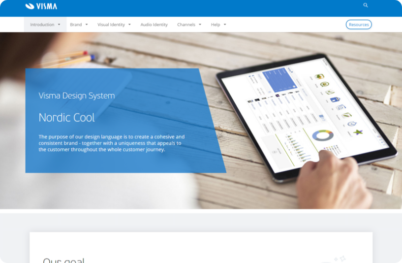
Our brandbook is the go to place if you want to read more about marketing and branding related information and find resources of the same. It covers everything from overarching principles related to brand hierarchy to strategy. You can also find all of our imagery, our illustration library, fonts and resources that are more closely related to creating advertisement, presentations, PR and the like.
Tools and licenses
To enable easy ways of collaboration and sharing we have a set of tools we recommend when you work as a designer in Visma. On Internal UX tools on Confluence you can learn more about these tools and request and access licenses to start using them.

Communication and collaboration
For communication we use Slack and for collaboration we use Mural, Trello and Google Drive.

Design and prototyping
For design and prototyping we mainly use Adobe Creative Cloud and Balsamiq Cloud.

Research and testing
For online testing we use UsabilityHub.
How to order design from the Product design team
Visual design is supplied for the most common UI elements, illustrations and icons in our libraries. These are what we call foundation and building blocks in the Nordic Cool visual design model. Using these assures high quality, AA compliance and getting well established design patterns for free.
If you need custom design for a specific context or find that something is missing, it can be ordered from the Product design team and created upon request. Requests are sent via Trello.
To make sure we deliver value to our customers and end-users, we recommend that custom requests are based on findings obtained by following the steps in the Visma UX Value Loop.
Identify and specify need
If you find, based on findings obtained from user research, that you need UI elements, icons or illustrations that you cannot find in our libraries, the product design team will make them upon request.
Iterative design process
Based on your specification and Nordic Cool, the designer will create design suggestions. Based on feedback, the designer will iterate the design until you and your customers are satisfied.
Implementation
The approved design will be delivered to your project and ready for implementation. If it is of general interest, the design will be added to our libraries.
Responsibilities and offering
The Product design team owns the design language and system related to product design and UX. They:
- Work as a design pool, creating designs in line with our visual design language
- Continuously develop and maintain useful tools for the UX community and development teams to enable good execution on visual design for our products and services
- Are responsible to package the tools and resources to empower teams to quickly execute on the Nordic Cool design language with high quality
The Product design team

Fredrik Fernberg
UX & Creative Director
Malmö

Amanda Lundius Mörck
Corporate UX Manager
Malmö

Paul Popa
Corporate Design Lead
Malmö
Cristina Iftode
Front-end Lead
Sibiu

Radu Dragoș
Senior Product Designer
Sibiu

Liviu Ispășoiu
Senior Visual Designer
Sibiu
Narchie Batol
UI/UX designer
Malmö

Calin Mohan-Bacila
UI designer
Sibiu

Mihai Baciu
Senior Front-end Developer
Sibiu
What happens after you contact us?
Once you have contacted us, we will reach out to learn more about your request.
We will create a task according to your specifications and assign a suitable designer who will follow up with you throughout the design process. If you need other design expertise we might connect you with the UX Best Practices or UX Studio teams.
