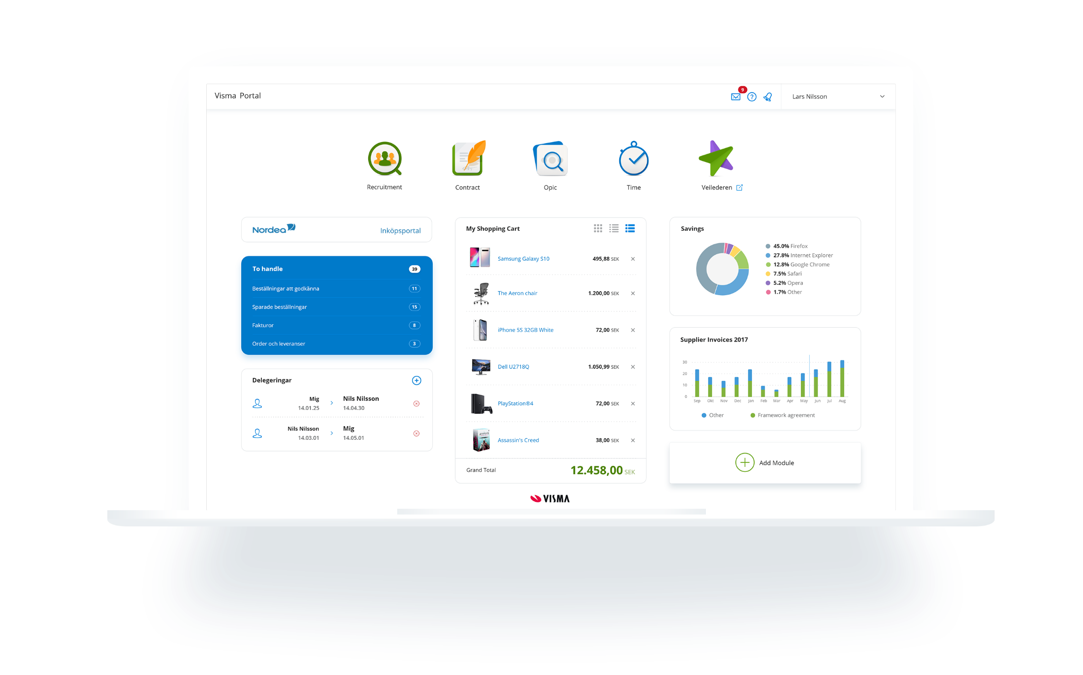
Showing is better than telling
These example products are meant to illustrate the width and flexibility of our product design language, Nordic Cool, with the goal of inspiring product development teams to create sophisticated and meaningful products.
Example products
Blue menu
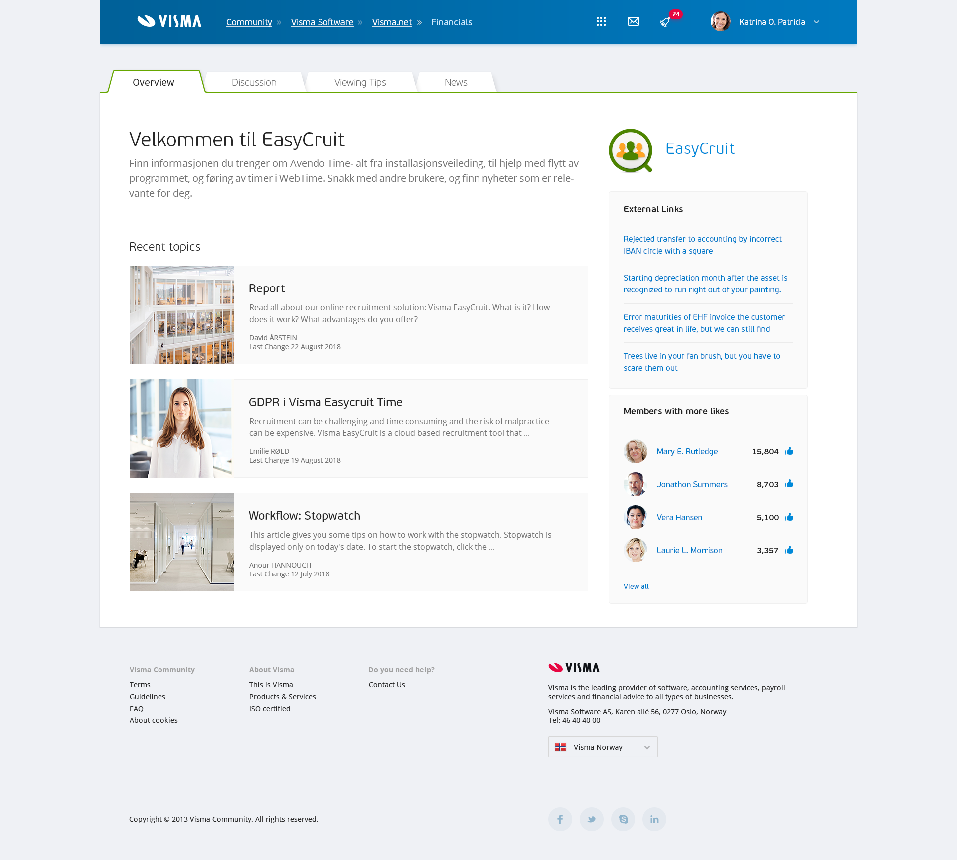
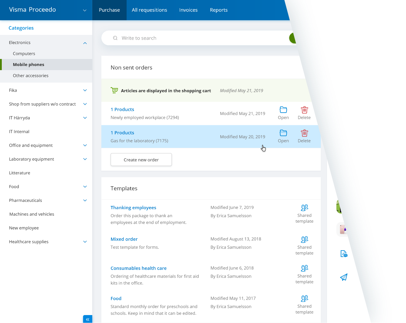
Blue is Visma’s core brand colour. Together with the blue tinted background it sets the tone for the Visma ambiance. One can say that everything resonates with the blue. The blue colour also has a decorative purpose, and acts as a frame that grounds visually busy content such as dense grids and lists. The blue colour makes our administrative tools more inviting and comfortable to work with throughout long hours.
White menu
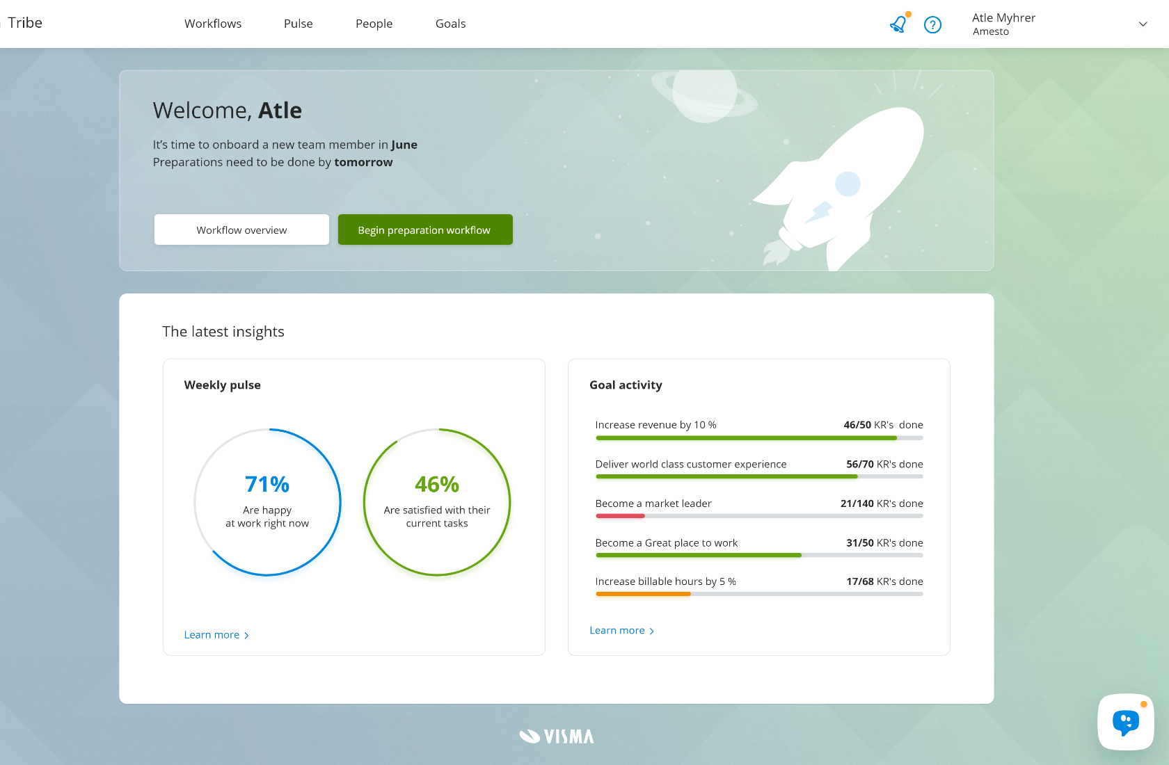
The white menu gives space to more colourful content. It is used in white labeled products and where the context allows for more images and illustrations.

Flexibility
Say hello to the two faces of Nordic Cool; Our classical Blue together with its sibling White. The ambiance of Nordic Cool springs from a bright and calm visual experience that uses blue as its core colour. In its classical form, that manifests itself with a blue horizontal menu, but many other visual components in the interface carry a tint of blue or use blue shades. Together, this constitutes the Visma ambiance. This can also be achieved without the traditional blue menu.
We offer these options to better cater for applications and services that are working with less administratively heavy tasks and have more visual content that should afford to be highlighted and given proper space and focus.
Go through the customer journey
So what is it like for our customers to move between touch points in our customer journey? Below you have the opportunity to experience it yourself through one of our many examples.
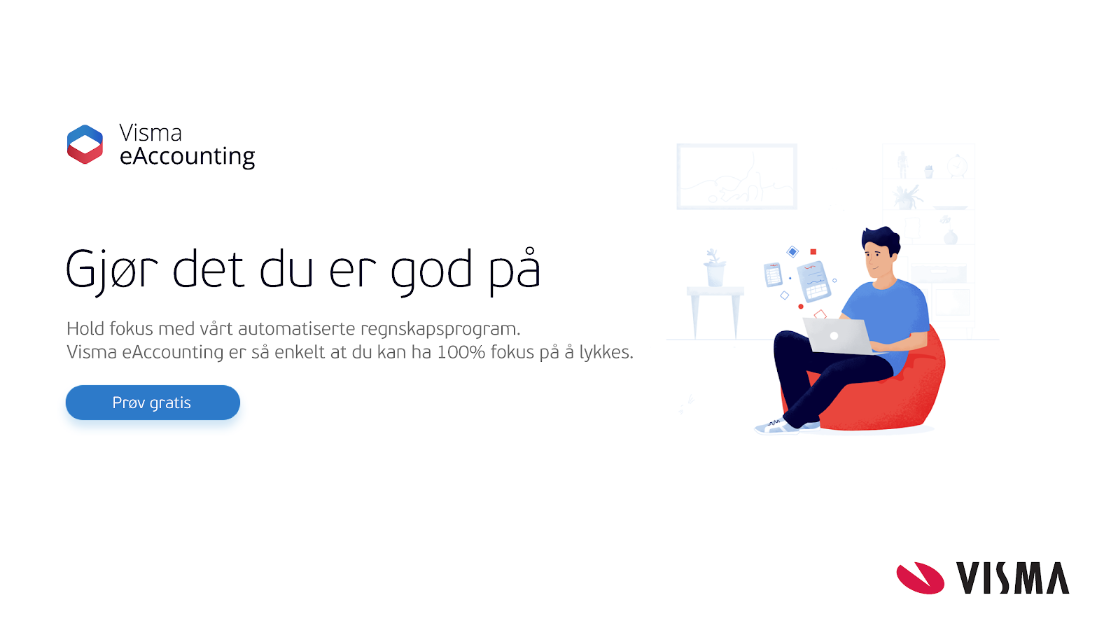
Accounting - Ad
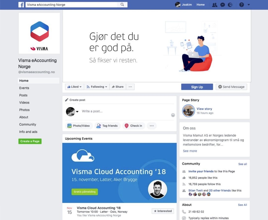
Accounting - Social Media
Accounting - Website

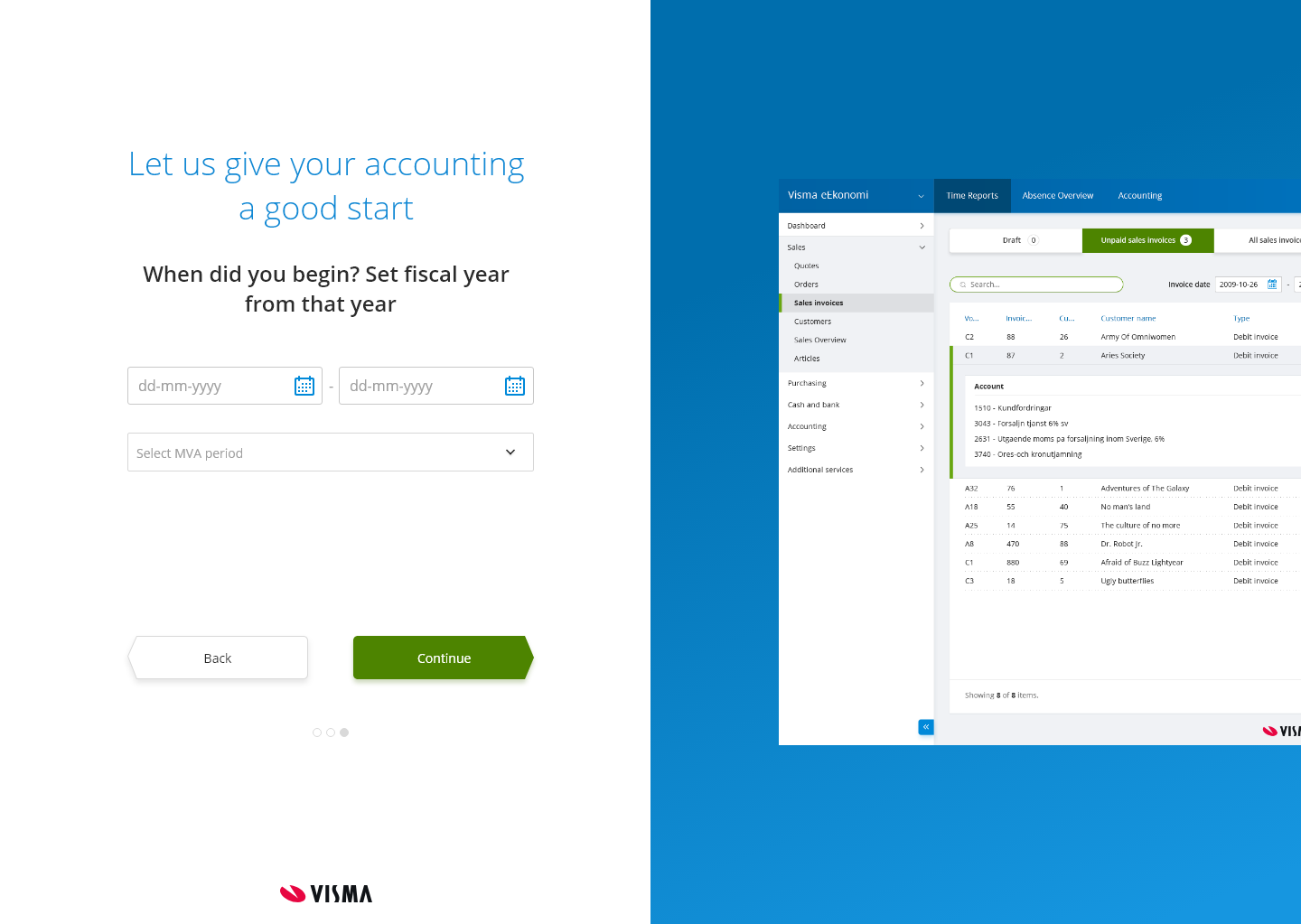
Accounting - Sign-up
Accounting - Email

Accounting - Login
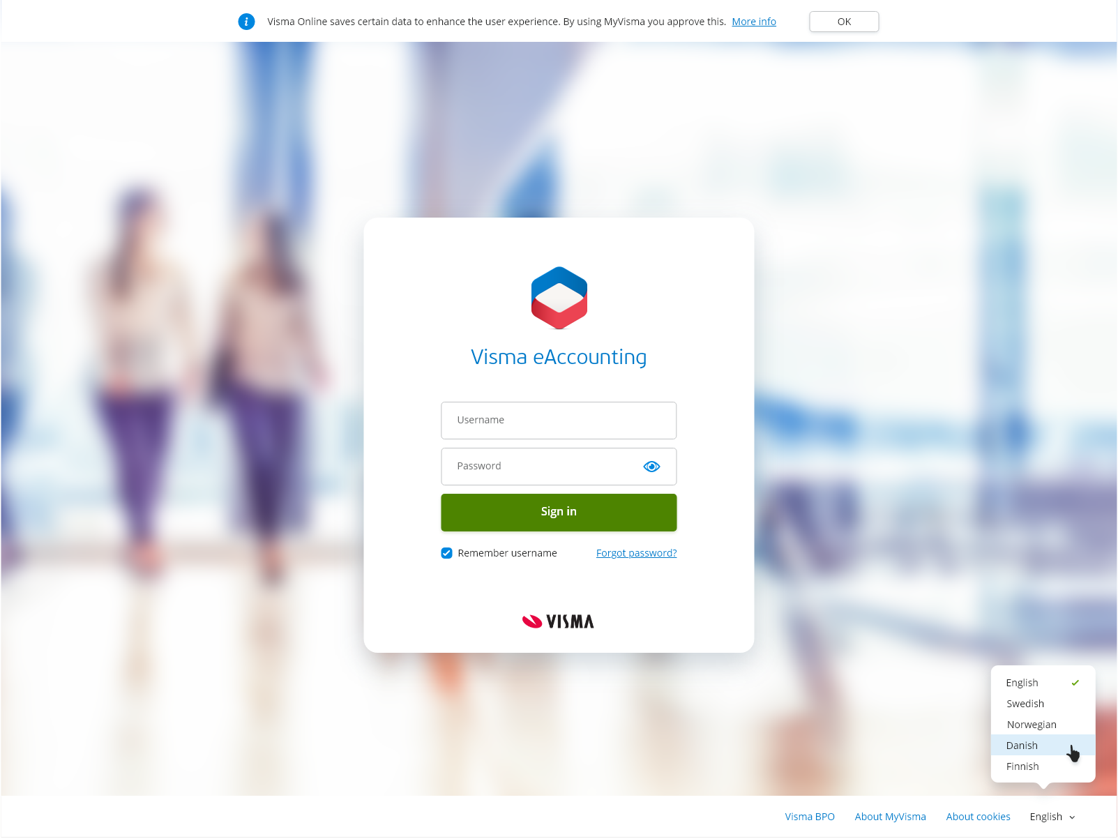
Accounting - Product
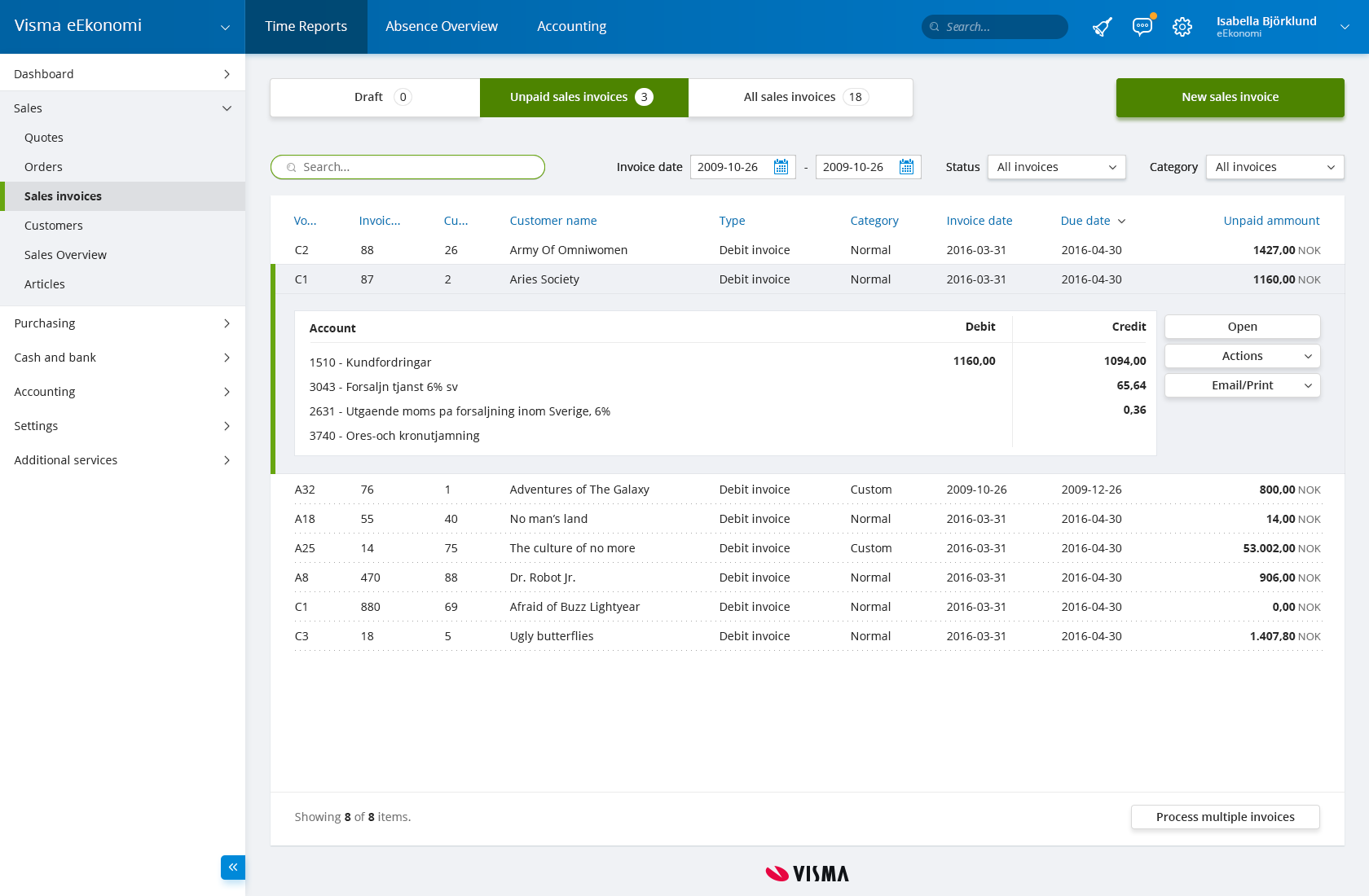
Easycruit - Ad

Easycruit - Website

Easycruit - Mobile

Easycruit - Email

Easycruit - Login
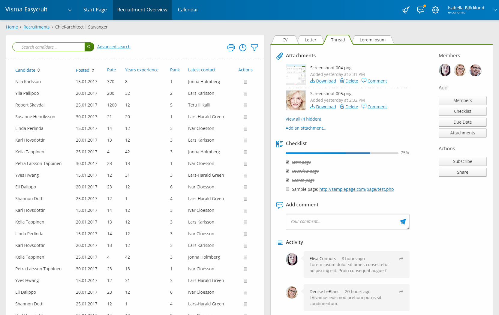
Easycruit - Product
Easycruit - Community


 Accounting
 Easycruit
 Payroll
