
Nordic Cool 3 icons
Note that these icons are in Nordic Cool 2 style and should not be used for products using Nordic Cool 3. If you need Nordic Cool 3 icons, check the icon library or contact your UX person, or email ux@visma.com.
Toolbar icons are used to provide quick shortcut access to common actions and commands. The toolbar icons are placed in the toolbar area of an application, and there are two types of toolbars to place these icons: Application toolbars, and functionality specific toolbars. The standard size of a toolbar icon is 32 x 32 pixels, however some applications use 24 x 24 pixels. We do not recommend using toolbar icons of smaller size than 32 x 32 pixels, since it often turns out poor and is hard to interpret/read for users. The NC2 toolbar icons have a shadow and are designed to fit on a light toolbar, not on a dark background. Contact UX to get hold of toolbar icons for a dark toolbar (Nordic Cool 1 generation). Today we have over 120 toolbar icons, to avoid this number from exploding we recommend to limit the amount of icons put in the toolbar. See the “Toolbar” section in the UX guidelines for recommendations on what actions that shall be provided in the form of toolbar icons, and which should not. Also recommendations on which order to place the icons and how to group them.
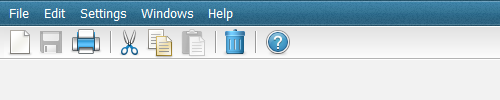
Example: Normal application toolbar in a desktop application.
Visma toolbar icons
Available toolbar icons in Nordic cool 2 style for a silver colored toolbar.
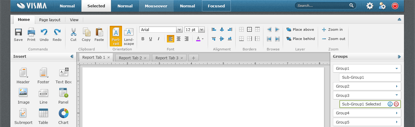
Visma ribbon icons
A ribbon is a more advanced toolbar that can fit more actions and commands than the normal toolbar. Two sizes of the icons can be used in the ribbon, 32 x 32 pixels for more commonly used commands and 16 x 16 pixels size for less used and standard commands. The toolbar icons displayed above can hence be used for more commonly used commands since they have the larger, same size. We have besides the toolbar icons also gathered common 16×16 pixel icons for the ribbon, e.g. actions regarding for font, alignment, borders. See the “Ribbons” section in the UX guidelines for recommendations on how to organize the icons and which size to choose.